Star rings, waves and a black-and-gold product finish form a series of marketing visuals for the new REDMAGIC phone.
Project Type
Brand & Product
Client
Marketing agency for REDMAGIC
Year
2025
Our role
AI poster key visuals & product scene rendering
01 / Background
How does each of a new phone's tech selling points get its own image?
The REDMAGIC launch campaign needed to convey the sci-fi imagination of an “ultra-futuristic flagship,” the tech story of liquid cooling, and the black-and-gold finish of the Golden Saga phone and gaming tablet. The posters were split into three groups, launch teaser, tech selling point and product showcase, so each type of message had its own clear key visual.
Ring structures bring a sci-fi feel, waves and Chinese-style figures turn “liquid cooling” into imagery with cultural flavor, and the black-and-gold product images highlight materials and contours. One series, three distinct moods, covering the launch, the technology and the products.
02 / Creative Highlights
Star rings, waves, black and gold: each with its own mood.
01
A centered star ring for the teaser posters
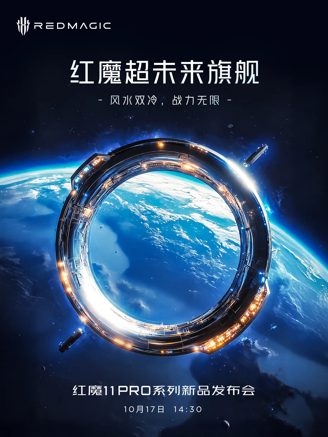
Both the space station and black hole posters use a centered ring as the key visual. Metal structures and points of light convey the ring's scale, and the ring stands well apart from the planet behind it, giving clear depth; the text area stays fixed, so even with different materials, they read instantly as one set of teaser posters.
02
Giving the water a story
In “Wind and Water Rising,” the character lunges forward with a martial move; in “Like a Fish in Water,” a giant fish made of water surrounds the figure. Robe hems, hand gestures and the direction of the waves build momentum together, turning liquid cooling from a technical term into a memorable image with a gaming feel.
03
Letting light reveal the black-and-gold finish
The phone stands on a carbon-fiber car body, and the tablet sits at an angle near a motorcycle's dashboard. The black background keeps the image clean and uncluttered, gold trim and silver highlights outline the products' edges, and the round ornament and camera area on the back of the phone and the tablet's large back panel are what draw the eye.
04
Leaving room for titles and launch info
The images leave open space for the title, brand logo and launch time, so however epic the scene, the promotional information stays clear and easy to read.
03 / Final Posters
Six final posters, used across three REDMAGIC launches.
Arranged by piece, each one a final poster officially released by REDMAGIC: what it shows and why it's composed this way. For how each image was settled step by step, see “Case Study.”
01
Space Ring · Space Station
REDMAGIC 11 Pro Series launch teaser
Poster 01
A space station ring looming over Earth
The metal ring carries modules and a glowing band of warm lights, with a small spacecraft on each side to show at a glance how big the ring is. The ring sits well in front of the blue Earth behind it; the title goes on top and the launch time below.
A space station ring looming over Earth · Final 1
02
Black Hole Halo
REDMAGIC 11 Pro Series launch teaser
Poster 02
A black hole ring made of light and fire
The entire ring is formed of orange light and flames, with only a small bright point in the center as the heart of the black hole; two small objects being pulled in hang on the ring, echoing the small spacecraft in the space station poster. The ring's size and position match the space station poster, so side by side they form one set of teaser posters.
A black hole ring made of light and fire · Final 1
A youth in blue strikes sideways with a sword as the water behind him curls into a giant fish swimming toward the upper right, literally drawing “like a fish in water” and giving liquid cooling an image. A row of white surf runs along the bottom, overlaid with the calligraphy titles “Like a Fish in Water” and “Liquid Cooling Black Tech.”
Water curls into a giant fish turning back · Final 1
Teal wind and water curl from lower left to upper right, with the figure in the middle thrusting out a palm strike, so wind and water are both visible in one image. It shares the same bottom surf and calligraphy title as “Like a Fish in Water,” and the two were released as a pair.
Wind and water swirl around the figure · Final 1
05
Golden Saga · Black-and-Gold Product Scenes
REDMAGIC 11 Pro+ and Gaming Tablet 3 Pro
Poster 05
The phone stands on a carbon-fiber spoiler
The sports car's spoiler is glossy carbon fiber with a woven texture and gold trim. Against the black background, directional highlights trace the phone's edges, and the gold ring on its back draws the eye first.
The phone stands on a carbon-fiber spoiler · Final 1
Poster 06
The tablet leans against a motorcycle's front
The motorcycle's dashboard and body are black-and-gold carbon fiber; the tablet sits at the very front of the frame, with only a corner of the bike showing, so the product is the star.
The tablet leans against a motorcycle's front · Final 1
04 / Results
A series of marketing posters for the new launch.
These images were released by REDMAGIC's official Weibo and belong to three groups of marketing posters: the 11 Pro series launch teaser, the Liquid Cooling & Gaming Technology Launch, and product posters for the Golden Saga phone and gaming tablet. We generated and refined with AI the key visuals for the two ring posters (space station and black hole) and the two liquid-cooling posters, “Like a Fish in Water” and “Wind and Water Rising”; for the two Golden Saga product posters, we rendered the black-and-gold carbon-fiber scenes and made local edits.
Case Study
Liandan AI Studio × REDMAGIC Launch Posters | One ring, one wave, one coat of black and gold
A gaming phone was about to launch, and its posters had to say three things: the new phone is coming, the cooling is impressive, and the shell is black and gold.
Our job was to create a key visual for each of the three.
These are AI key visuals for the REDMAGIC 11 Pro series launch campaign, created by Shenzhen Alchemy Technology Co., Ltd. (Liandan AI Studio) on commission from REDMAGIC's marketing partner.
Below, group by group, ring, liquid cooling and black and gold, we explain how the images were settled step by step.
AI key visuals and retouching for two ring teaser posters (space station, black hole) and two liquid-cooling wuxia posters; black-and-gold material rendering and local edits for the Golden Saga product scenes
Specs
3:4 portrait, key visuals at 1080×1440, plus layered PSDs; product scenes upscaled to 8K
Distribution
REDMAGIC official Weibo: 11 Pro series launch teaser, Liquid Cooling & Gaming Technology Launch, Golden Saga product posters
Produced by
Shenzhen Alchemy Technology Co., Ltd. (Liandan AI Studio)
01
Three groups of posters, three moods
The client had several social media posters to produce in this round, and handed us two of them: ring icon posters and water element posters. All sized 1080×1440, 3:4 portrait.
For the ring group, the client had already settled on two and wanted the third to be a space station; a black hole version was added later. The water element group needed the feel of a game character unleashing water skills.
Before the launch, a third task came in: placing the phone and tablet in black-and-gold sports car and motorcycle scenes.
Teaser poster: space station ringLiquid cooling poster: Wind and Water Rising
02
Rings: same position, three materials
The core of the teaser posters is the ring at the center of the frame. We fixed its position and size first, so the layout team could start working in parallel, and whatever material came later wouldn't touch the text area.
The space station poster took two rounds. In the first, an astronaut stands on a planet's surface looking up at a huge metal ring. The client wanted to lean toward “water and giant typhoons,” with the ring set further apart from the background. In the second round, we lifted the camera into space, replaced the planet with a vast ocean, put a typhoon's eye inside the ring, and made the ring a metal structure with modules and light bands; the final added small spacecraft on both sides to convey scale.
Round 1: an astronaut on a planet's surface looking up at the ringRound 2: camera lifted into space, a typhoon's eye inside the ring
The black hole poster went through the most changes. A realistic black hole was too big with too hard an outline, and didn't look like part of the same set as the space station poster; a purple nebula ring based on a reference looked like an icon and lacked impact. In the end, we changed approach: the whole ring is made of orange light and flames, with only a small bright point in the center. For the final, we used Photoshop fill to extend the starry sky outward and matched the ring's size to the space station poster.
Realistic black hole: circle too big, outline too hardPurple nebula ring: looks like an icon, not enough impactA ring made of light and fire: the final direction
03
Liquid cooling: drawing a cooling technology as a martial arts move
“Liquid cooling” is a technical term that's hard to remember on a poster. The client's idea: have a game hero unleash a water-element move, with fish and water in the frame, possibly with Chinese kung fu moves.
To set these apart from the crowd posters in the same batch, we first tried animal heads on human bodies surfing giant waves, but the look was too odd, so we dropped it. After switching to Chinese-style wuxia characters, the figure had real presence but was too close to the camera to show the reach of the move. So we pulled back to a full-body figure turning sideways with a sword, with the water behind him curling into a giant fish turning back: that's “Like a Fish in Water.”
Early direction: animal heads on human bodies, surfingChinese-style wuxia: figure too close to show the move's reachFull-body figure, water curling into a giant fish
The same group also explored “Red Water Beast” (a red-eyed water dragon rising from the waves) and “Where Water Flows, a Channel Forms.” The client wanted wind and water together in one image, so we switched to “Wind and Water Rising”: wind and water swirl around the figure into a vortex, with him striking from the center. “Where Water Flows, a Channel Forms” had a similar composition, and in the end “Wind and Water Rising” was kept.
Red Water Beast: a red-eyed water dragon rising from the wavesWind and Water Rising: wind and water swirling around the figure into a vortex
The final “Wind and Water Rising” switched to teal water curling from lower left to upper right, sharing the same bottom surf and calligraphy title as “Like a Fish in Water,” and the two appeared as a pair in the teaser for the Liquid Cooling & Gaming Technology Launch.
04
Black and gold: changing materials on a white model without moving the structure
The biggest risk with product posters is AI distorting the product or the car. The client provided white models: the phone standing on a sports car's spoiler and the tablet leaning against a motorcycle's front, with a black-and-gold color scheme and carbon fiber texture required.
We compared several image editing approaches, and Qwen image editing preserved the original structure best. The prompts were very specific: body panels changed to glossy woven carbon fiber, gold trim, and high-contrast, product-grade lighting. The phone's position didn't move at all.
The client's white model: the phone standing on a sports car spoilerThe spoiler changed to black-and-gold carbon fiber, the phone's position unchanged
All edits to the motorcycle poster built on the same base image: first outpainting, then fixing structures like the dashboard and fuel cap, and finally adding carbon fiber details, so the environment didn't drift; once complete, it was upscaled to 8K.
The client's white model: the tablet leaning against a motorcycle's frontThe motorcycle scene after switching to black-and-gold carbon fiber
05
What this project achieved
One brand, one launch, three groups of posters telling three different stories. Our approach: lock the structure first, then open up the materials: the ring keeps a fixed position and size, the two liquid-cooling posters share one layout, and the product scenes change only materials, not structure.
So each time the client gave feedback, only part of the image changed, and what had already been settled wasn't overturned. These images were ultimately released by REDMAGIC's official Weibo and used for the 11 Pro series launch teaser, the Liquid Cooling & Gaming Technology Launch and Golden Saga product promotion.
FAQ
FAQ
When AI makes product posters, how do you keep the product and car from distorting?
In this project, the client first provided white-model scenes, and we used Qwen image editing to change materials directly on the white models; compared with several other approaches, it preserved structure best. All later edits were made on the same base image, fixing structure first and then adding carbon fiber details, before upscaling to 8K.
How do you make every poster in a series look like part of the same set?
For the ring teaser posters, the ring's position and size were fixed first, and the space station and black hole versions only changed materials; the two liquid-cooling posters share the same bottom surf and calligraphy title. That way, changing the images never touches the text area, and layout can proceed in parallel.
How long does an AI marketing poster project take from brief to delivery?
For the ring and water element posters, we received the brief in mid-September and delivered the first batch of images the same day, then three batches over three days based on client feedback; the black-and-gold product scenes went from receiving the white models to sending back revisions in a single day.
What sizes and files can be delivered?
Here, key visuals were delivered in 3:4 portrait at 1080×1440, along with layered PSDs for the client's layout work; product scene images were upscaled to 8K, suitable for high-resolution product posters.
Approach
Giving the key visual, product contours and text each their own place.
We first set the position of the ring and the figures in the frame, then brought in materials and scenes. All key visuals use 3:4 portrait: the ring group came in two materials, space station and black hole; the water group centers on a hero character, swimming fish and Chinese kung fu moves, giving one tech theme two different looks.
After generating the images, we adjusted the distance between foreground and background and handled harsh edges with methods like Photoshop fill, making later retouching and layout easier.
The product posters change materials directly on the client's white models: the bodies become black-and-gold carbon fiber, lit with directional highlights. All edits to the motorcycle scene were made on the same base image, so the environment didn't drift, and product placement, image texture and brand information stayed consistent throughout.